Allergen-Friendly Menu Design: Layout Tips That Keep Diners Safe
Every restaurant owner knows the feeling: a diner asks "what's safe for me to eat?" and the server has to flip through a grease-stained folder to find the allergen chart. The information exists somewhere, but the way it's presented makes finding it slow, stressful, and unreliable.
The problem is rarely a lack of information. It's a lack of allergen-friendly menu design — the visual structure that makes allergen data scannable, clear, and impossible to miss.
Good design doesn't just look professional. It reduces the risk of an allergen incident, speeds up ordering for diners with dietary needs, and demonstrates the kind of care that earns trust and repeat visits.
Why Menu Layout Matters for Allergen Safety
Allergen information that exists but can't be found quickly is almost as dangerous as allergen information that doesn't exist at all. A diner with a severe peanut allergy shouldn't need to hunt for that information. It should be visible, consistent, and obvious across every section of the menu.
The real cost of allergen mistakes goes far beyond a returned meal. Legal liability, negative reviews, and insurance impacts all compound. But many of these incidents start with a simple design failure: the allergen information was there, but the diner didn't see it. Or the server couldn't find it quickly enough during a busy service.
Allergen-friendly menu design addresses this at the source. When allergen information is built into the menu layout — not bolted on as an afterthought — communication errors drop significantly.
Visual Hierarchy: Where Allergen Information Should Sit
Visual hierarchy is the order in which the eye reads information on a page. For a menu, the typical reading pattern goes: dish name, then description, then price. Allergen information needs to sit within this natural flow, not in a footnote at the bottom of the page.
Inline vs Separate Chart
There are two common approaches and they produce very different outcomes.
Inline placement puts allergen icons or labels directly next to each dish, usually between the description and the price, or immediately below the dish name. This is the safer approach because the diner sees allergen information in context — at the exact moment they're considering whether to order that dish.
Separate allergen charts list every dish in a table with allergen columns. These are thorough but impractical during service. Diners have to cross-reference between two documents. Staff need to locate the right chart. And separate charts frequently fall out of date when the menu changes.
For printed menus, inline placement is strongly preferred. For digital menus, both approaches can work because filtering eliminates the cross-referencing problem entirely — but inline placement still provides better context.
The Three-Line Rule
Each menu item should communicate its allergen status within three lines of text:
- Dish name — what it is
- Description — what's in it (including key ingredients that signal allergens)
- Allergen indicators — icons, labels, or codes confirming the allergens present
If a diner needs to read more than three lines to determine whether a dish is safe, the design needs simplifying.
Colour Coding: Making Allergens Instantly Recognisable
Colour is one of the fastest visual processing channels. Diners can spot a red warning icon in a fraction of a second, long before they read the text around it.
Recommended Colour Approach
A well-designed allergen colour system uses two or three colours with clear, consistent meaning:
- Amber or orange for allergen presence — visible without triggering alarm. Amber stands out against both light and dark menu backgrounds.
- Red for high-risk allergens or may-contain warnings — reserved for situations where cross-contamination risk exists but the allergen isn't a primary ingredient.
- Green for allergen-free confirmation — useful on digital menus where diners can filter by allergen and see a "safe" indicator.
What you want to avoid is a rainbow of 14 different colours for 14 different allergens. Research on visual perception consistently shows that people can reliably distinguish about four colours at a glance. Beyond that, the system breaks down and diners start guessing.
Contrast Requirements
Any colour-coding system needs to meet basic contrast requirements. This matters for accessibility — roughly 8% of men have some form of colour vision deficiency — but it also matters in the typical restaurant environment: low lighting, phone screens at odd angles, and printed menus that have been through the dishwasher.
Amber icons on a cream background don't provide enough contrast. Dark amber on white, or white icons on a dark amber background, work reliably across lighting conditions.
For restaurants aiming to meet WCAG accessibility standards, a contrast ratio of at least 4.5:1 for text and 3:1 for graphical elements is the benchmark.
Allergen Symbols and Icons: Choosing the Right System
Allergen icons serve as universal shorthand. Done well, a diner can scan a menu section in seconds and identify which dishes contain their allergen. Done poorly, icons become visual noise that nobody understands.
Standard vs Custom Icons
Several standardised allergen icon sets exist. The most widely recognised include:
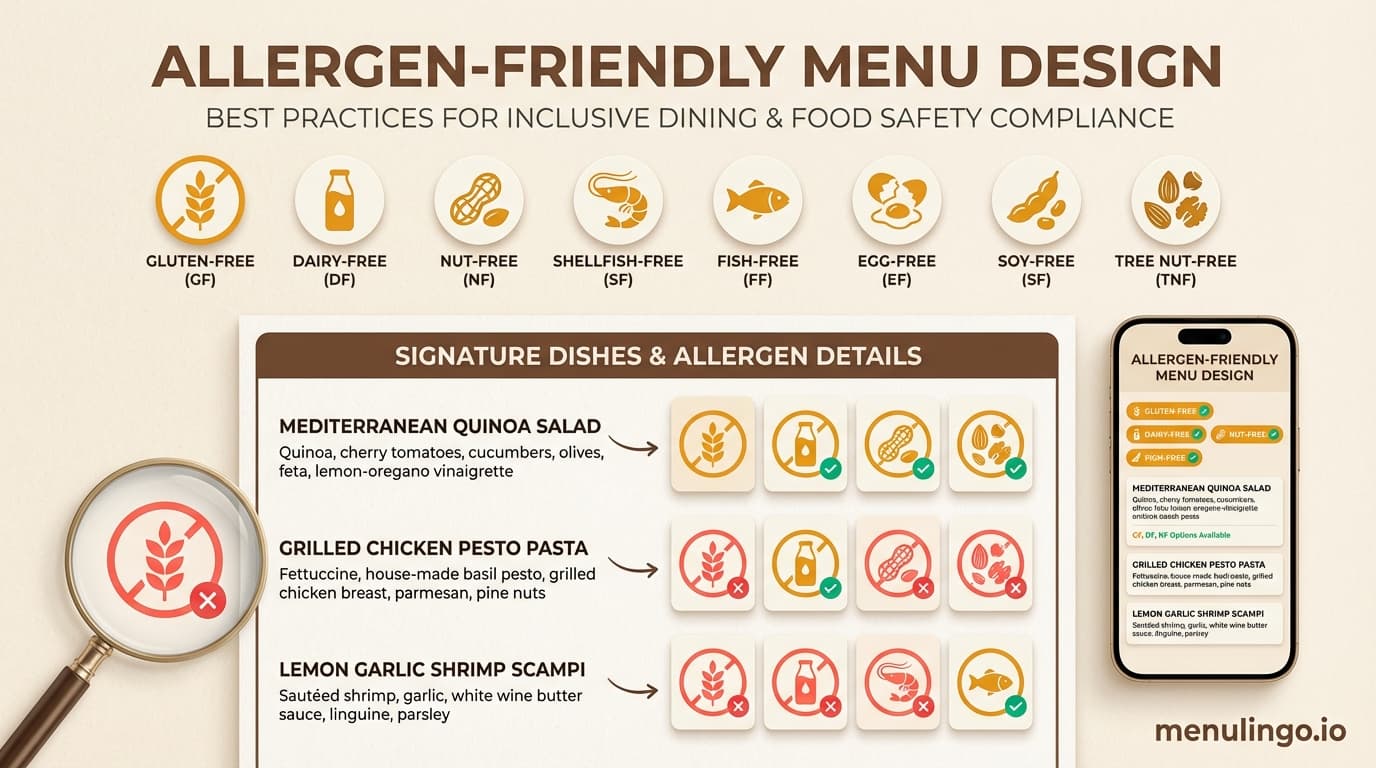
- EU-style allergen icons — circular icons with pictographic representations of each of the 14 allergens. These are familiar to diners across Europe and the UK.
- Text-based codes — short abbreviations (G for gluten, D for dairy, N for nuts) placed in small coloured badges. Simple but requires a legend.
- Custom pictographic icons — restaurant-designed icons that match the menu's visual style. These look polished but may confuse diners who are used to standard formats.
For most restaurants, using a recognised icon set — or a slight visual adaptation of one — is the safest choice. The goal is recognition, not originality.
Icon Placement Rules
Three principles for effective allergen icon placement:
Consistent position. Every dish should show its allergen icons in the same location. Below the description, right-aligned, in the same size. If icons jump around the layout, diners lose the visual pattern.
Adequate size. Icons need to be legible at reading distance. For printed menus, 8-10mm diameter is the minimum. For digital menus on a smartphone, 24-32 pixels ensures tappability.
Reasonable quantity. If a dish triggers six allergens, six icons in a row create visual clutter. Group common allergens or consider a "contains multiple allergens — tap for details" approach on digital menus. Printed menus may need to list the top three and include a footnote directing to the full list.
The Limitations of Printed Allergen Menus
Printed menus with allergen information face several structural problems that design alone can't fully solve.
Space constraints. A typical A4 or A3 menu has limited real estate. Adding allergen icons for every dish compresses descriptions, forces smaller fonts, or pushes the menu to additional pages. None of these improve the dining experience.
Update lag. When a recipe changes — a new supplier for the bread rolls, a different brand of soy sauce — the allergen information needs updating. Reprinting menus costs $200-500 depending on volume and quality. Many restaurants delay updates because of this cost, which creates a window where the printed allergen information is wrong.
Language barriers. Printed allergen icons work for diners who understand the symbol system, but international tourists may not recognise the icons or read the legend. A Japanese character for "peanuts" next to the icon doubles the space requirement. Covering 10 languages on a printed menu is physically impossible.
These limitations are why digital menus have become the preferred approach for allergen communication in restaurants with diverse clientele.
Digital Menu Design for Allergen Safety
Digital menus — typically accessed via QR code at the table — solve many of the design constraints that printed menus face. But they introduce their own design requirements.
Filtering vs Flagging
The two main approaches to allergen display on digital menus:
Allergen flagging shows icons next to each dish, similar to a printed menu. The diner scans the list and identifies safe options visually. This works well for diners managing one or two allergens.
Allergen filtering lets the diner select their allergens at the top of the menu. The menu then hides or dims dishes containing those allergens, showing only safe options. This is dramatically more effective for diners managing multiple allergens or for parents ordering for children with complex dietary needs.
The strongest digital menu designs offer both. Flags provide at-a-glance information for browsing; filters provide personalised safety for diners who need it.
MenuLingo's allergen safety features use client-side filtering — the diner selects their allergens on their own device, and the filtering happens entirely on their phone. No health data is transmitted to any server, which addresses GDPR concerns while giving diners complete control over what they see.
Mobile-First Layout
Over 85% of QR code menu scans happen on smartphones. Allergen-friendly digital menu design must prioritise the mobile viewport:
- Allergen filter bar at the top of the screen, always visible
- Dish cards with allergen icons visible without tapping to expand
- Tap-to-expand for full allergen detail, ingredient lists, and cross-contamination notes
- Clear typography at 16px minimum for body text — no tiny fonts
A diner should be able to filter their allergens, scan the visible dishes, and choose what to order within 30 seconds. If the interface requires pinching, scrolling sideways, or navigating between pages, the design is adding friction where safety needs clarity.
Multilingual Allergen Labels
For restaurants in tourist areas, allergen labels need to appear in the diner's language — not just the restaurant's default language. This is where digital menus offer an advantage that printed menus simply cannot match.
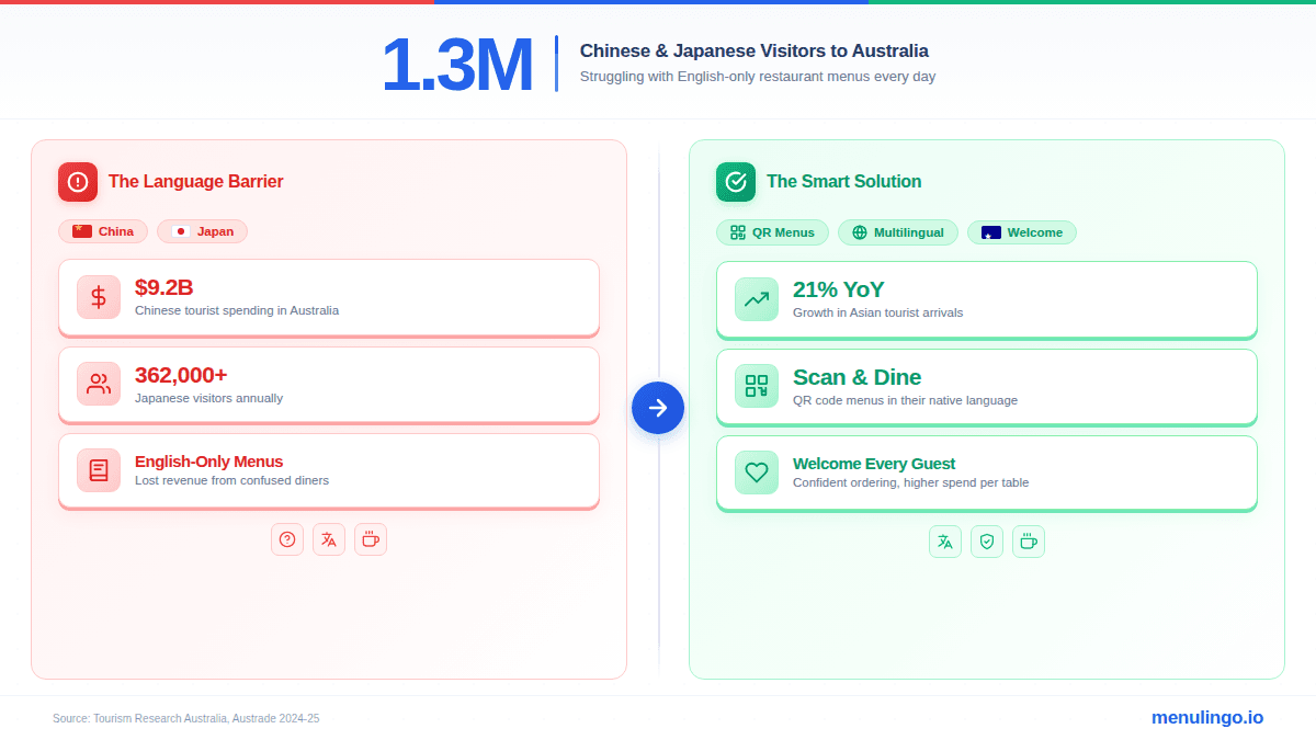
A well-designed multilingual menu displays allergen names, descriptions, and warnings in the diner's selected language. The word for "peanuts" appears as "cacahuetes" for a Spanish speaker, "arachidi" for Italian, or the appropriate characters for Chinese, Japanese, or Korean. This eliminates the language barrier that causes many allergen miscommunications with international diners.
Designing for Staff, Not Just Diners
An often-overlooked aspect of allergen-friendly menu design is how well the menu serves your staff. During service, a waiter fielding an allergen question needs to find the answer in seconds — not minutes.
Design your menu (printed or digital) so that staff can quickly verify:
- Which allergens a specific dish contains
- Which dishes are free of a specific allergen
- Whether cross-contamination risk exists for a given allergen
A compliance checklist can help ensure your menu design covers both the diner-facing and staff-facing requirements.
Common Allergen Menu Design Mistakes
Several patterns appear repeatedly in menus that create unnecessary risk:
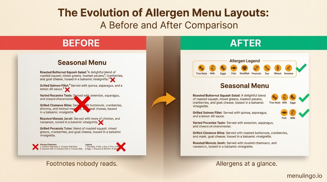
Footnote-only allergen information. Placing all allergen data in a footnote at the bottom of the menu, referenced by tiny superscript numbers. Most diners never see it.
Inconsistent icon usage. Using icons on some sections and text-only allergen lists on others. This trains diners to rely on icons, then leaves them without icons where they matter most.
"May contain" overuse. Labelling everything as "may contain traces of nuts/gluten/dairy" because it feels safer from a legal perspective. In practice, it makes the allergen information useless — if everything may contain everything, diners with allergies can't make informed choices.
No allergen key. Using custom icons or abbreviations without a visible legend on the same page. The legend should appear at the top of each menu page, not just once at the front.
Outdated information. The most dangerous design mistake isn't visual — it's temporal. Allergen information that was accurate six months ago may not be accurate today. Any allergen-friendly menu design needs a built-in process for regular review and updates.
A Practical Approach to Redesigning Your Menu
If your current menu's allergen presentation needs improvement, here's a practical sequence:
Step 1: Audit your current allergen data. Work with your head chef to verify every dish against the allergens required in your jurisdiction. The 16 major allergens across global frameworks is a good reference point.
Step 2: Choose your icon system. Pick a recognised allergen icon set and commit to it across every menu, every location, and every format (printed, digital, takeaway).
Step 3: Redesign the layout. Move allergen information inline with each dish. Use the three-line rule. Apply consistent colour coding. Test the layout in realistic conditions — print it out, look at it under your restaurant's actual lighting.
Step 4: Go digital. Consider whether a digital menu with allergen filtering would serve your diners better than a printed allergen chart. For most restaurants — particularly those with international customers or complex menus — the answer is yes.
Step 5: Establish a review cycle. Set a calendar reminder to review allergen information monthly, and after every menu change. A digital platform that prompts these reviews automatically removes the reliance on memory.
Ready to Upgrade Your Allergen Menu Design?
Designing an allergen-friendly menu is one of the highest-impact changes a restaurant can make for both safety and service quality. Whether you start with a printed menu redesign or move directly to a digital solution, the principles are the same: make allergen information visible, consistent, scannable, and accurate.
MenuLingo provides allergen-friendly digital menus with AI-powered allergen detection, client-side filtering, and multilingual display — starting at $19.99/month on the Starter plan. See pricing or start your free trial.
Ready to make your menu multilingual?
Join restaurants already serving diners in 9 languages with accurate allergen information. 14-day free trial, no credit card required.
Start Your Free Trial